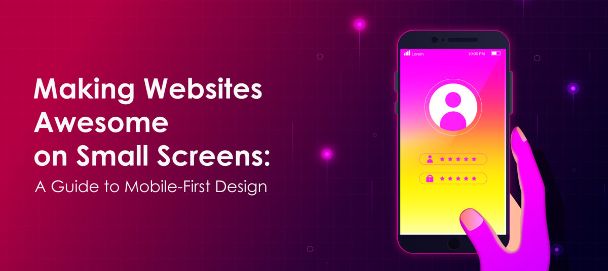
Making Websites Awesome on Small Screens: A Guide to Mobile-First Design
Hey Guys!, Are you curious about making websites that look super cool and work perfectly on tiny phone screens? Well, you’re in the right place! Today, we’re diving into the world of “Mobile-First Design,” a smart way to make websites that shine on mobile phones.
What is mobile-First Design?
Okay, let’s break this down. Imagine you’re building a super cool tree house. Instead of making it big and then squishing it into a tiny tree, you’d start by designing it for the tree’s size, right? That’s exactly what mobile-first design is about!
Instead of designing for big computer screens first and then squeezing them onto phones, we start by making things look amazing on small screens, like phones. Why? Because most of us use our phones to check out websites these days. So, it makes sense to give them the best experience!
Why It’s Awesome:
People Love Phones: Everybody’s using phones to browse the web. So, when your website looks great on their tiny screens, they’ll love visiting it.
Super Speedy: Making things fit on small screens helps cut out extra stuff you don’t really need. That makes your website load faster, and who doesn’t love a speedy site?
Easy Peasy Navigation: Tiny screens mean less space, so you’ve got to be smart about buttons and menus. With mobile-first, you create simple, easy-to-tap buttons and menus.
Google’s Happy: Google likes mobile-friendly websites. So, if your site rocks on phones, Google might give it a thumbs-up and show it to more people in search results.
Future-Proofing: Think about it—new gadgets keep popping up, like foldable phones and cool watches. Starting small helps your site fit nicely on these new gadgets too.
How to Do It:
Big Ideas, Tiny Screens: Start with the big stuff, like the main message you want to share. Fit it into the small phone screen and build around it.
Finger-Friendly: Make buttons big enough to tap without a magnifying glass! Remember, fingers are thicker than mouse pointers.
Easy Reading: Use fonts that are comfortable to read on a phone. Nobody likes squinting, right?
Less is More: Keep only the important stuff. That way, your site doesn’t feel crowded, and visitors can find what they need without getting lost.
So, there you have it—mobile-first design in a nutshell. Remember, it’s all about making your website look stunning and work like magic on small screens. With a little creativity and some smart thinking, you’ll have people loving your site, whether they’re tapping away on their phones or clicking on a big computer. Happy UI design, everyone!
Similar Articles
-

Blockchain Gaming: Where Fun Meets Decentralization 04-12-2024
Introduction The gaming industry has always been a hotbed of innovatio
-

The Art of Product Design: Creating Timeless Toys 03-19-2024
Crafting Memories, One Toy at a Time: This is a journey of innovation
-

ACES: Revolutionizing Color Management in Visual Effects 02-19-2024
ACES, which stands for the Academy Color Encoding System, is a standar
-

Game Development Tools and IDEs: A Comprehensive Guide 02-15-2024
Game development is a complex and multifaceted process that requires a
